AssessmEnt drawings
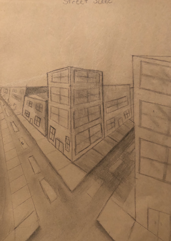
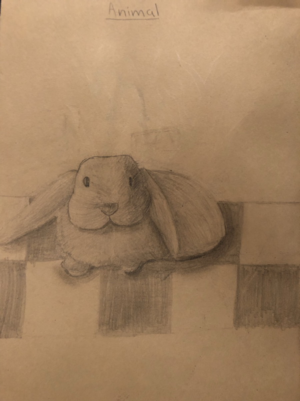
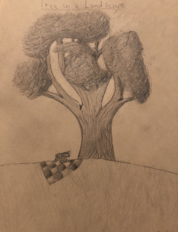
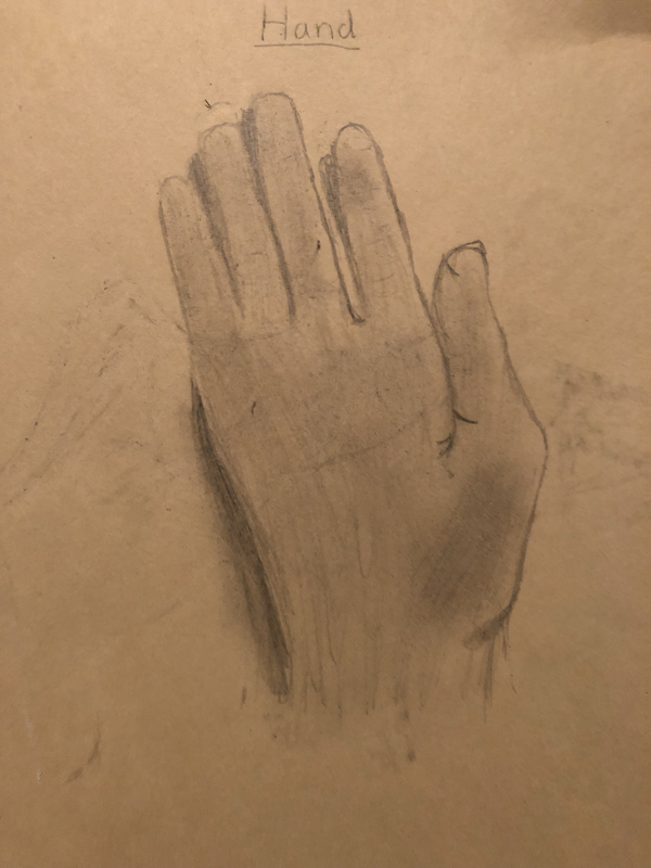
The project was to draw four scenes without any help. It was to assess our art skills and tell the teacher what we need to learn. The drawings were a tree, a animal, a city scene, and a hand.
Shading shapes
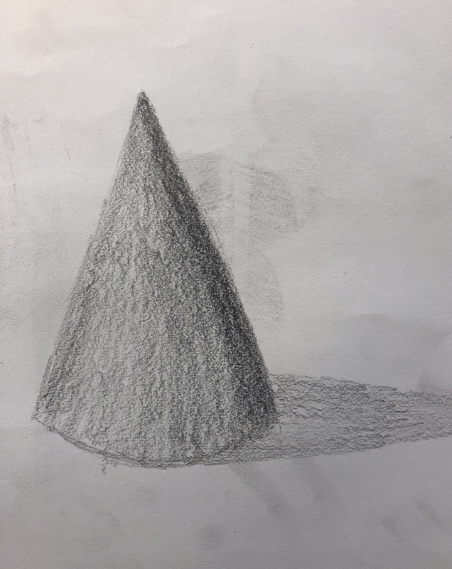
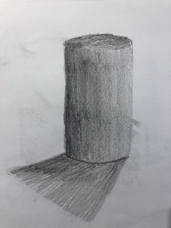
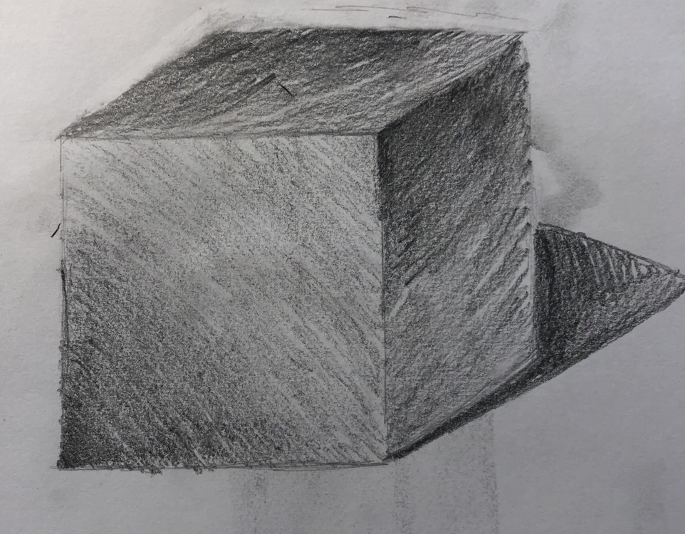
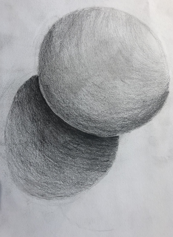
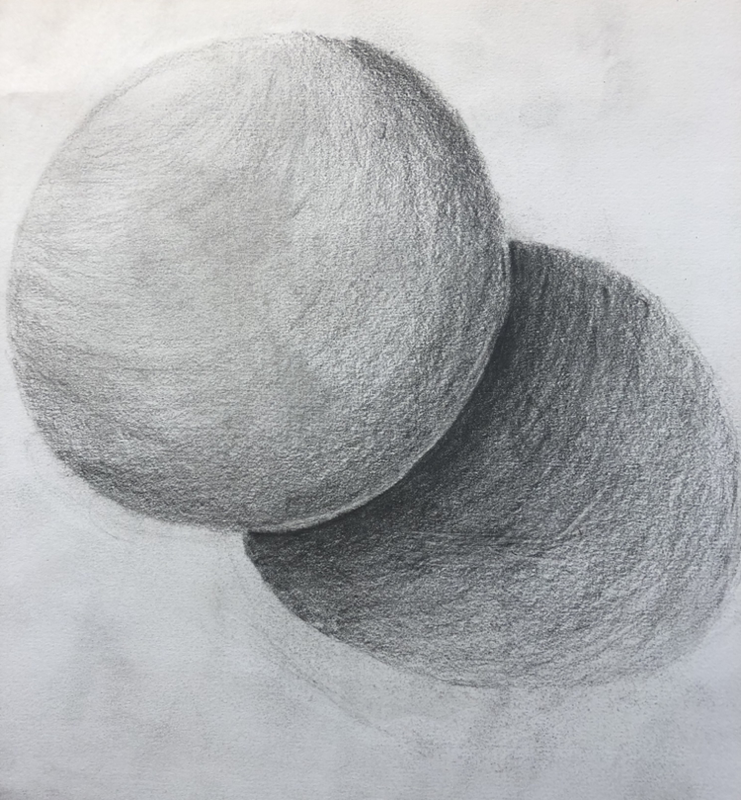
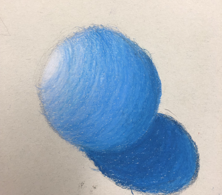
the project was to draw realistic shapes. The shapes were cube, cone, cylinder, and sphere. It was drawn in pencil. We were also supposed to draw the shadows.
still life pRactice
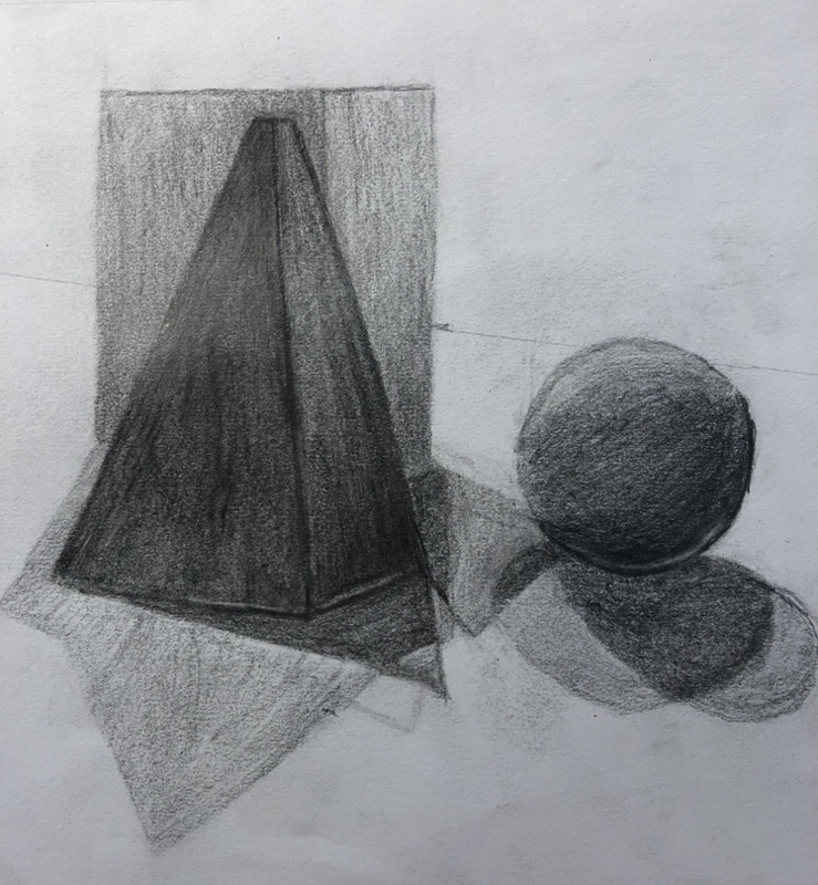
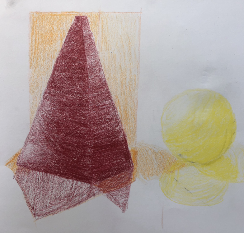
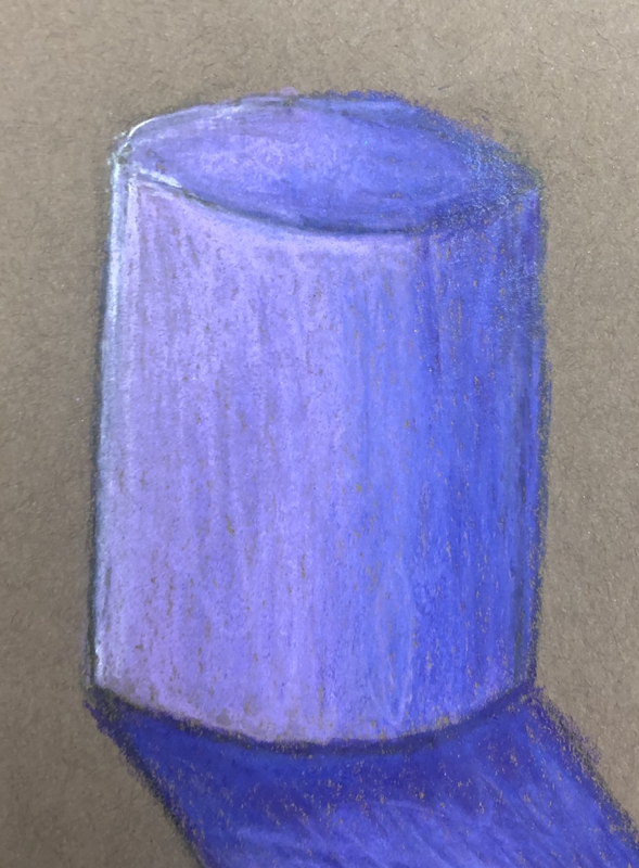
the assignment was to draw two versions of a still life one colored and one black and white. The shapes were a rectangular prism, a sphere, and a square based pyramid. We were also supposed to draw the shadows.
Still liFe project: in progress
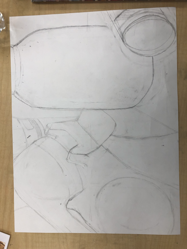
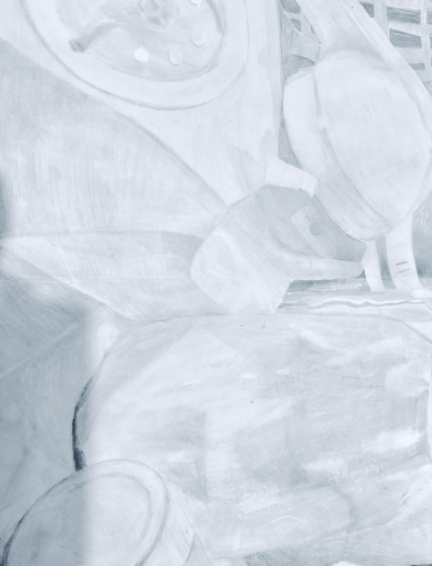
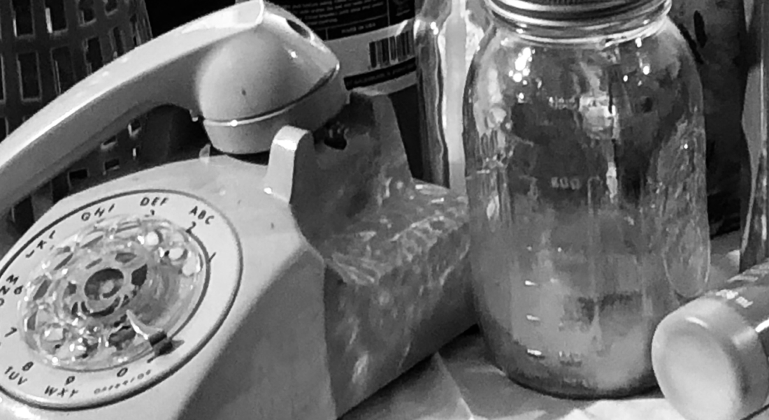
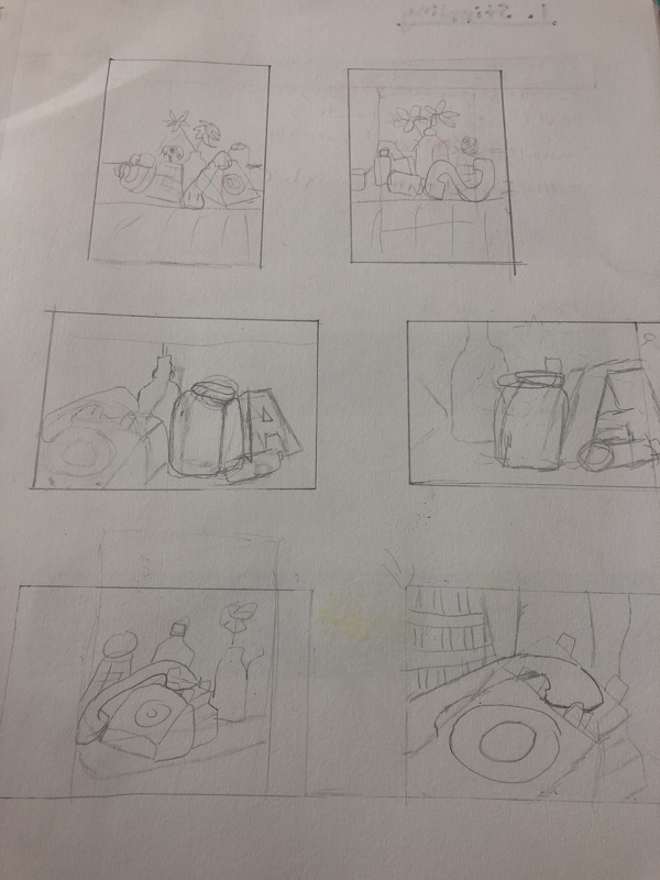
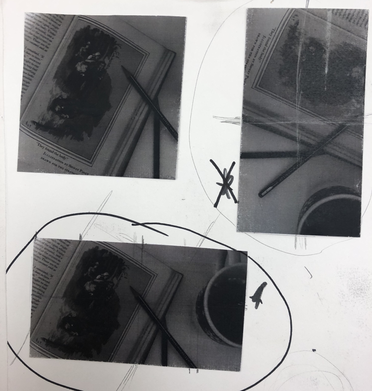
the project was to draw a still life. The first thing we had to do was draw compositional sketches and then choose one you like and take a picture of it. Then we had to draw it and add shading and highlights/shadows to make it look more realistic.
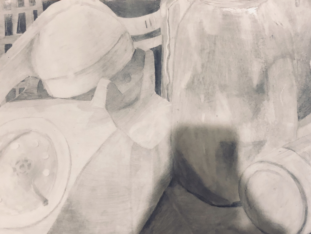
Still Life PRoject: finisheD
1.Describe how you arranged your composition. Discuss your use of the elements and principles. Is it a successful composition?
I arranged my compilation randomly it has no pattern. The elements I used were form and value. This is shown through three dimensional objects and the lightness and darkness of the drawing to show form and create a realistic look. The principles of art shown are contrast and emphasis. Emphasis is shown through the phone because it is the biggest and contrast is present because the background is darker making the objects in front stand out. The composition is successful but it could use some touch ups.
2. Did you use a wide range of values? (A range from white to black with at least 9 values). Explain how is this evident?
I did use a wide range of values; the back has dark values while the front has medium to light values. It is evident in the shadows and the background compared to the foreground.
3. Explain how your knowledge and creating practice studies with value contributed to your piece.
my previous experience with pencil helped me to shade correctly and to not draw harsh lines.
4. Describe the blending and transitions in your objects (discuss your use of pressure with pencil and other techniques to achieve this).
The darker the value the more pressure I used. I also started the first layer with an H pencil and used a B and HB pencil to darken the drawing.
5. Explain how your interpretation of texture is essential in capturing the look of the object.
The textures are very smooth and plastic looking and I achieved that look by shading with soft lines and adding white highlights.
6. If you could recreate your pieces what would you do differently to enhance the final outcome?
I would try to not put as much pressure on the pencil and I would try not to rush as much. If I had taken my time it would of come out much better.
Pen & ink unit
Texture practice
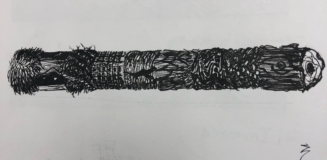
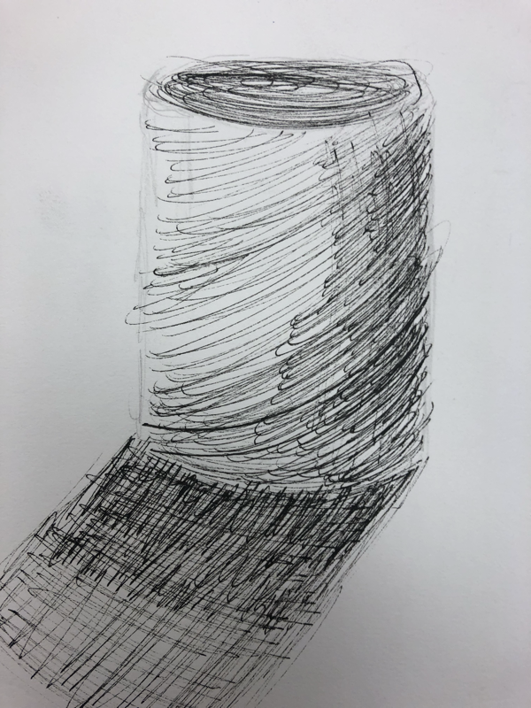
The first project was to do a value chart of the main textures. The second project was to watch a video and create a cylinder with nine different textures. The last project was to draw each sphere with a different texture. I went to dark on my spheres so it is hard to see the different textures.
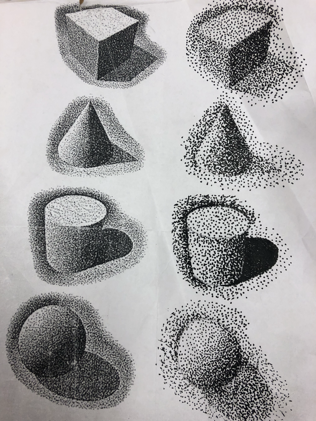
Shape and 4 teXture Practice
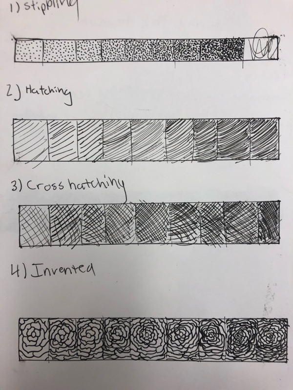
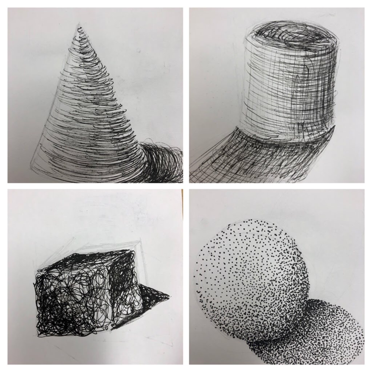
The 4 textures project was to practice the four main textures stippling, hatching, cross hatching, and invented. The value got darker every box. The other project was to draw 3D shapes using the main pen techniques. The sphere was stippling and the cone was hatching. The cylinder was crosshatching and the sphere was an invented technique.
Practice pen textuRes
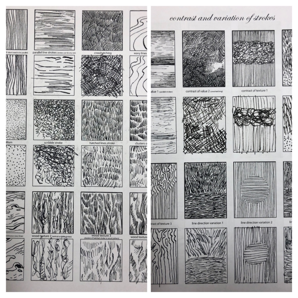
the project was to copy the pen techniques. It was hard to make it look identical and I had trouble drawing tiny dashes. It taught me how to make light strokes with the pen.
100 Textures
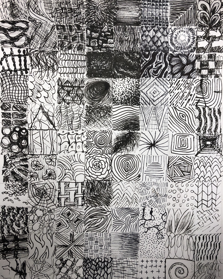
The project was to draw 100 textures. They had all had to be different. It also had to have andoverall gradient so I made the top darker.
Texture landscape
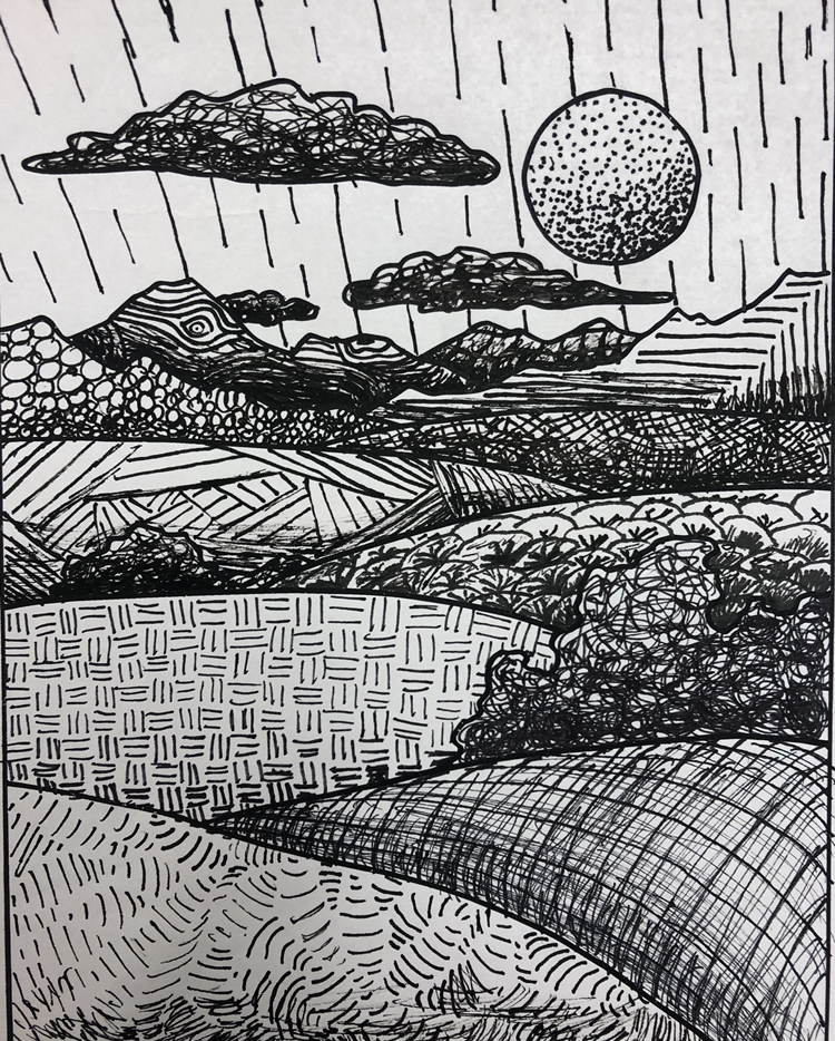
For this project I had to draw a landscape using different textures. It had to have shading to make it look three-dimensional. I reused a couple textures but most of them were original.
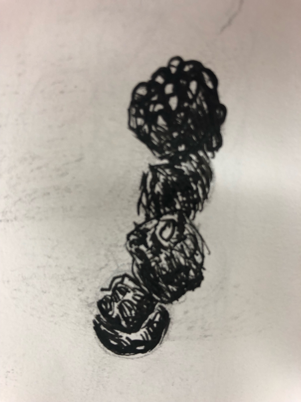
StipplIng practice
The project was to copy the shapes on the left side using stippling. I drew too dark on the cylinder and the circle is more of an oval.
Shapes with Textures
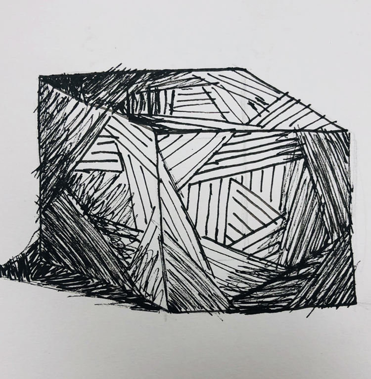
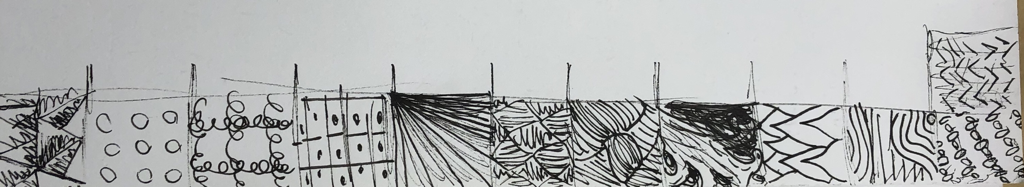
The project was to draw two 3D forms. Then we had to shade them using a pen texture. It had to fit the shapes and make it look three-dimensional.
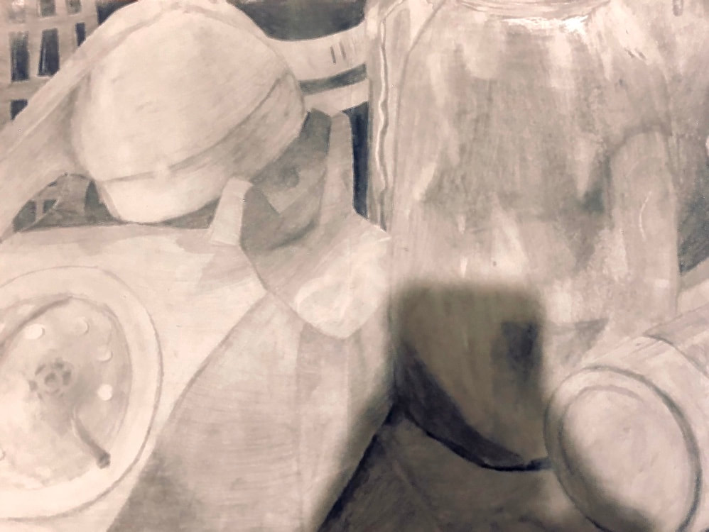
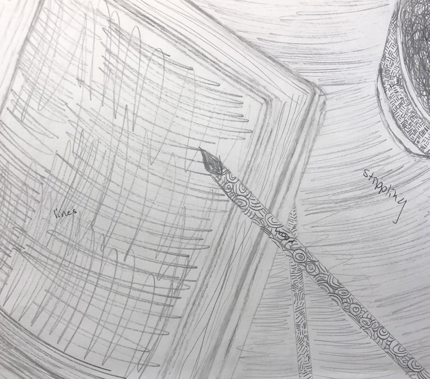
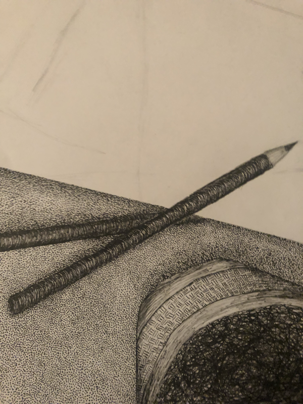
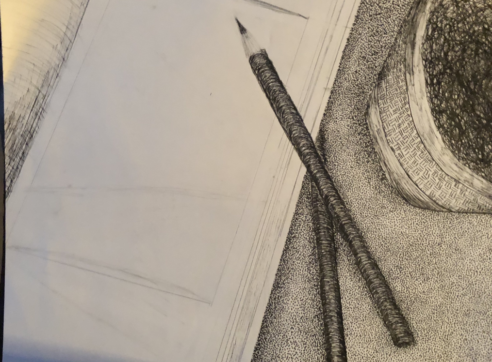
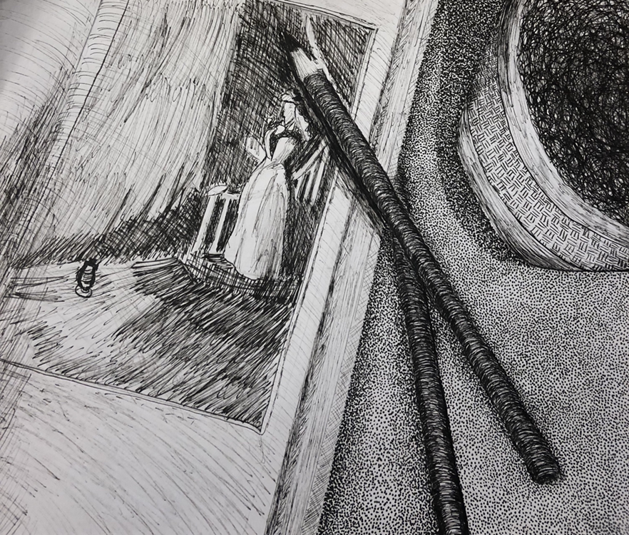
Pen & ink project
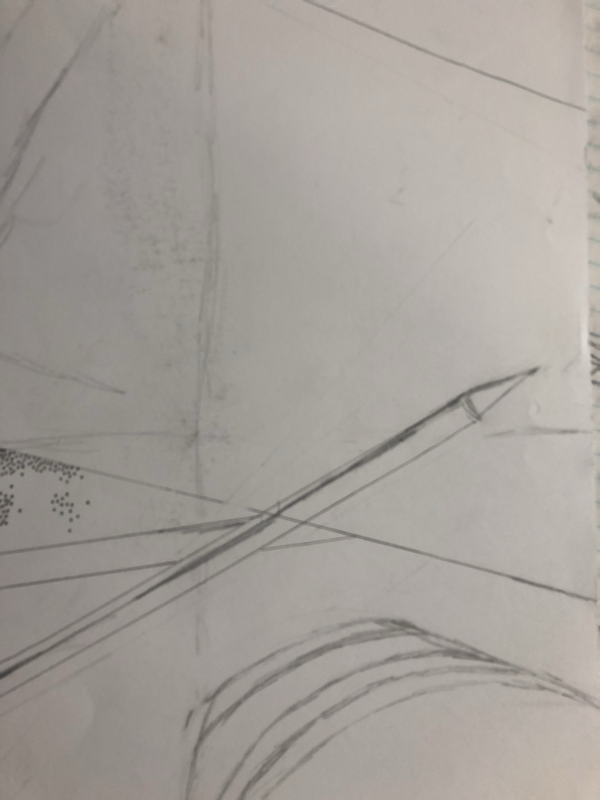
In PrOgress

pen & Ink project
finished
1. Describe how you arranged your composition. Discuss your use of the elements and principles. Is it a successful composition?
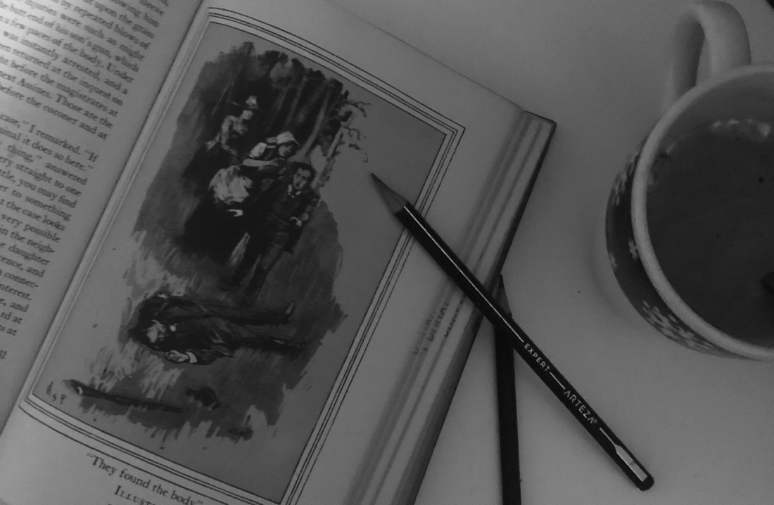
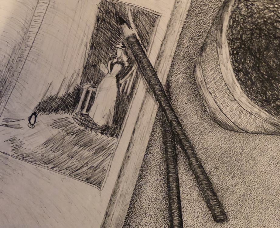
My drawing is asymmetrical and the items are going off the page to create visual interest. The elements I used were line and value; the line is shown in the use of different patterns and value is shown through shading to make it look realistic. The principles of design used were proportion and movement; proportion is how the book is bigger than the pencils and mug. Movement is how your eyes move from the book down the pencils to the coffee mug. I think it is successful; I could improve on some things but overall I am proud of what I drew.
2. How is texture and pattern are important in your composition?
Textures and pattern make the drawings look realistic, interesting, and creative. No one wants art that looks the flat and plain they want textures to create interest like using African mud cloth designs for the coffee mug.
3. Why is value so important in this project?
If there was no value it would look 2D and boring. Value allows you to make a 2D medium appear 3-Dimensional. It also creates interest and keeps the viewer engaged.
4. Describe your craftsmanship (How well the project is crafted technically).
I showed craftsmanship through my use of stippling and the pattern I used on the pencils. I also showed skill through realistic shading that creates depth.
5. Explain how your knowledge and creating practice studies with value and pattern contributed to the success of your piece.
Practicing how to draw correctly with a pen helped me learn to control my stroke and how to draw lightly by spacing your lines or dots.
6. When applying the pen and ink/pattern techniques why and how is it important to make sure you understand the concepts taught in class?
It is important to use the pen techniques we learned in class because they help you create value and depth. They also help you control your strokes which creates a clean sketch.
7. As a growing artist how do you think what you have learned will guide and better your future projects. Explain.
This project has taught me a lot. It taught me the value of patience because I rushed and had to restart the whole project. It also taught me how to be proud of yourself after lots of hard work even if it isn't perfect.
8. If you could recreate your piece what would you do differently to enhance your final outcome?
I would take my time on the book and make longer softer strokes. My pen was running out of ink so I had to make short, hard strokes which makes it looked rushed.
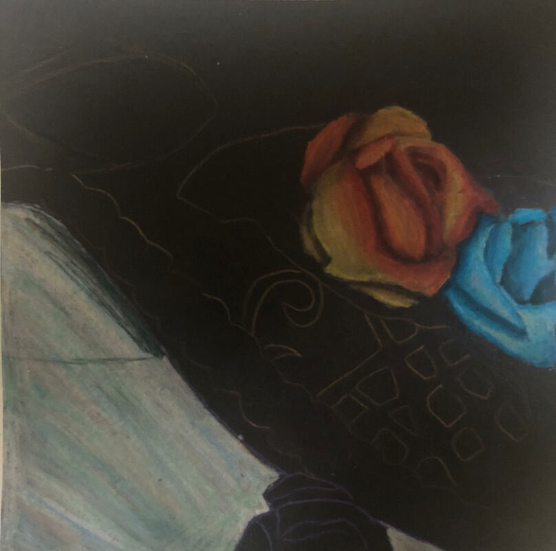
ColoRed pencil projecT
Prismacolor practice
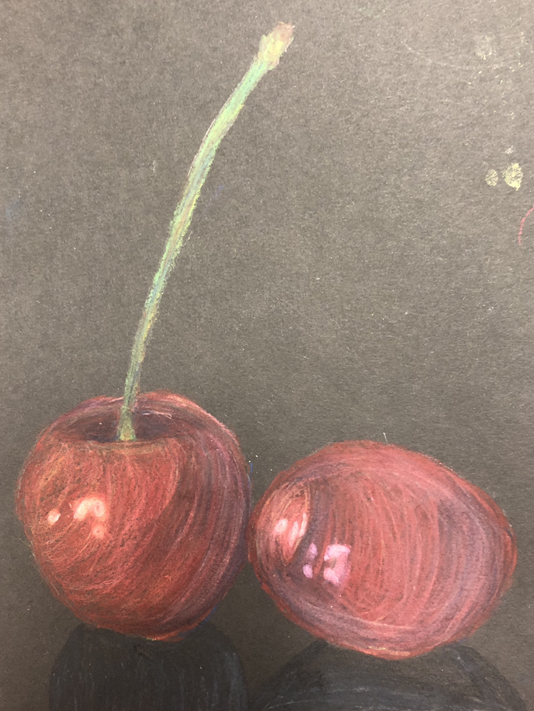
The project was to choose three prismacolors and shade shapes (sphere, cone, and cylinder) so they look 3D. The last project was to draw a fruit or vegetable using prismacolors. I chose cherries which are red but I added colors like blue, orange, yellow, purple, pink, and green to create dimension.
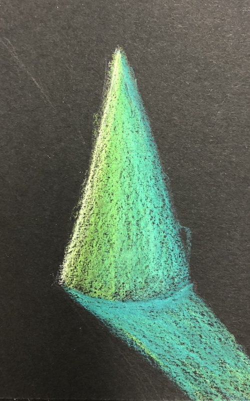
Pastel practice
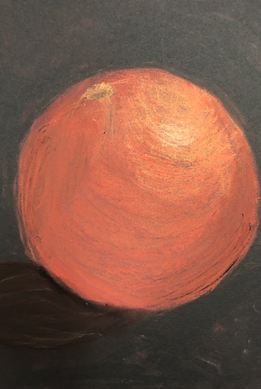
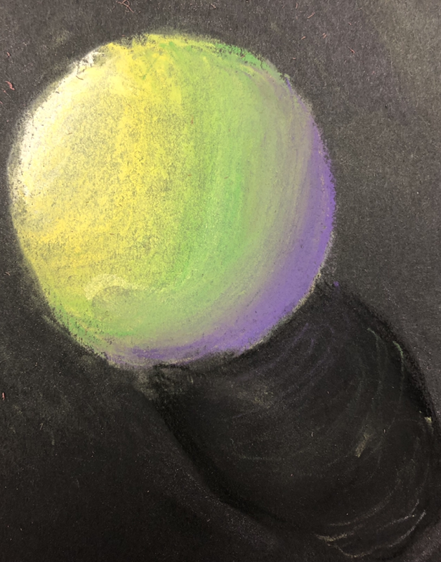
The first project was to draw a sphere with 4 different pastels with varying values and make it 3-dimensional. I chose to do Mardi Gras colors for my sphere. The second project was to draw a 3D fruit or vegetable using pastels. I chose and orange and used every color in the rainbow to create depth.
Watercolor pencil practice
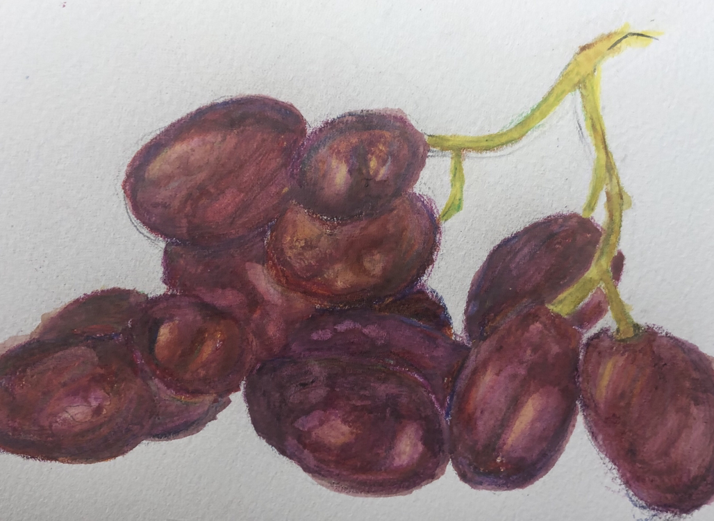
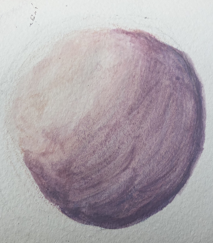
The first project was to paint a circle using watercolor pencils. I chose the colors pink, magenta, and blue.The second project was to paint a fruit or veggie using watercolor pencils. I chose to paint grapes and I added all of the colors of the rainbow to create depth.
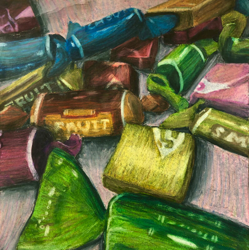
For this project I had to take reference photos of candy and sketch it out on a black piece of paper. Then I had to color it using prismacolor pencils. I used multiple layers, different streaks of color, and shadows to create depth and make it more realistic.
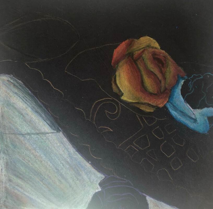
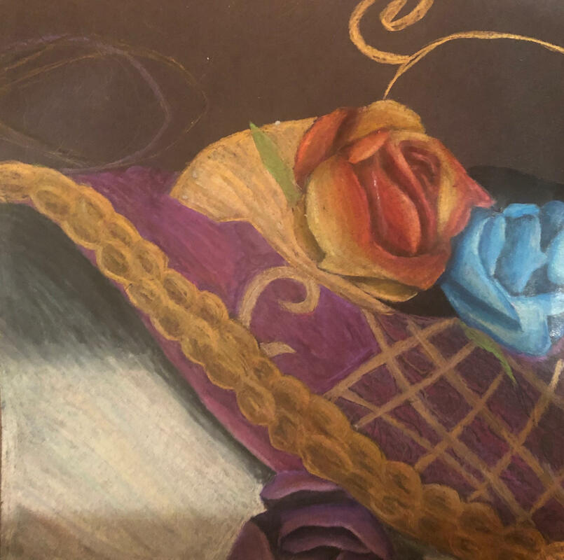
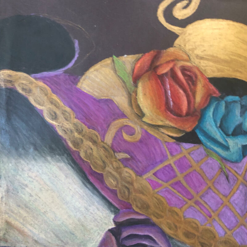
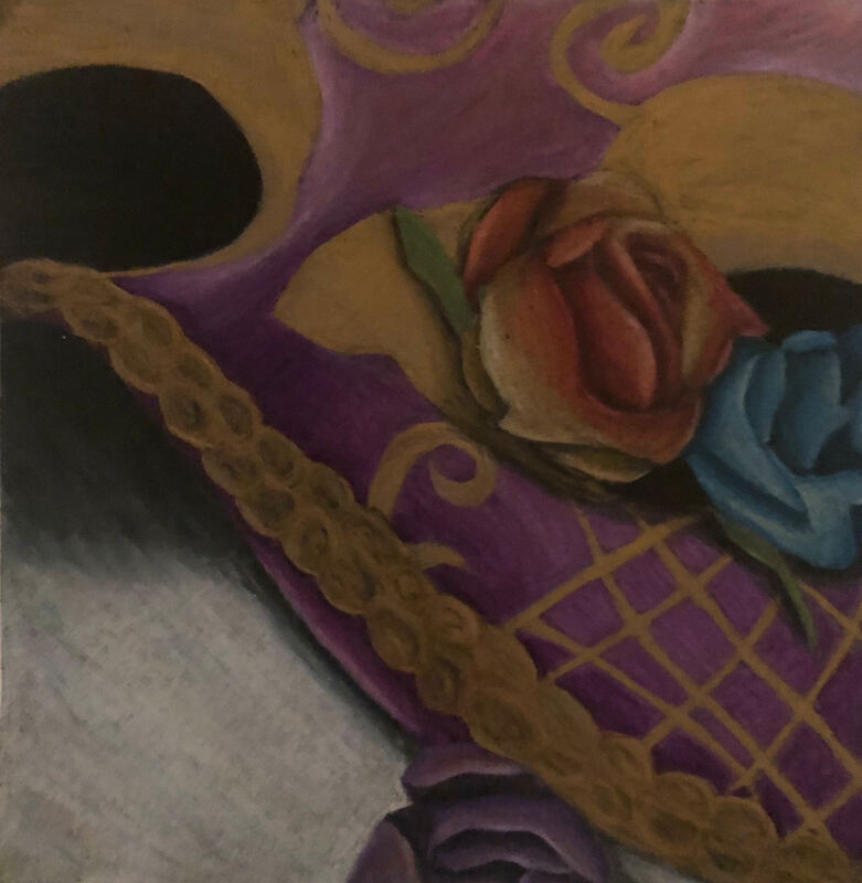
1. Describe the overall composition of your artwork (balance, unity, rhythm and movement).
the gold details and the flowers use asymmetrical balance to create interest. Unity is shown by the overlapping flowers on the mask. Rhythm and movement is shown when your eye starts at the purple rose and makes its way up the gold details to the other roses.
2. How did you use value to create dimension? Is this important? Why?
I used light values as highlights and dark values as shadows to create realistic lighting. If it was all one color it would look flat; values create interest. The gold and the white background makes the purple stand out.
3. What did you achieve by using exaggerated color?
I used exaggerated colors to create contrast. If all the colors were similar then it wouldn't have any depth; Exaggerated colors creates a focal point.
4. Describe the craftsmanship of your colored pencil/chalk pastel. (How good the project is technically crafted)
I used a technique where you add streaks of other colors to create depth and add interest. I used different shades for each to create a realistic color palette. Then i used light streaks of black and blue to create shadows and lighter values of white to create highlights.
5. Were you able to achieve depth by showing a foreground, middle ground and back- ground? Explain.
I achieved depth through the white background, dark purple middle ground, and gold foreground. The white makes the dark purple stand out and the purple makes the gold stand out. They all have different tints of color neutral, cool, and warm tones.
6. Explain your experience with colored pencil/chalk pastel. What were the obstacles and advantages?
Colored pencil is more vibrant while the chalk pastel is more muted and blurry. chalk pastels smudge easily which can make it hard to subtly change colors. Colored pencils can leave streaks or make dents in the paper. Chalk pastels are more useful for abstract or far away objects while colored pencils are more useful for detailed objects.
Printmaking Project
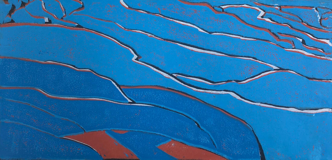
1. Describe the craftsmanship of your prints. (How good the project is technically crafted)
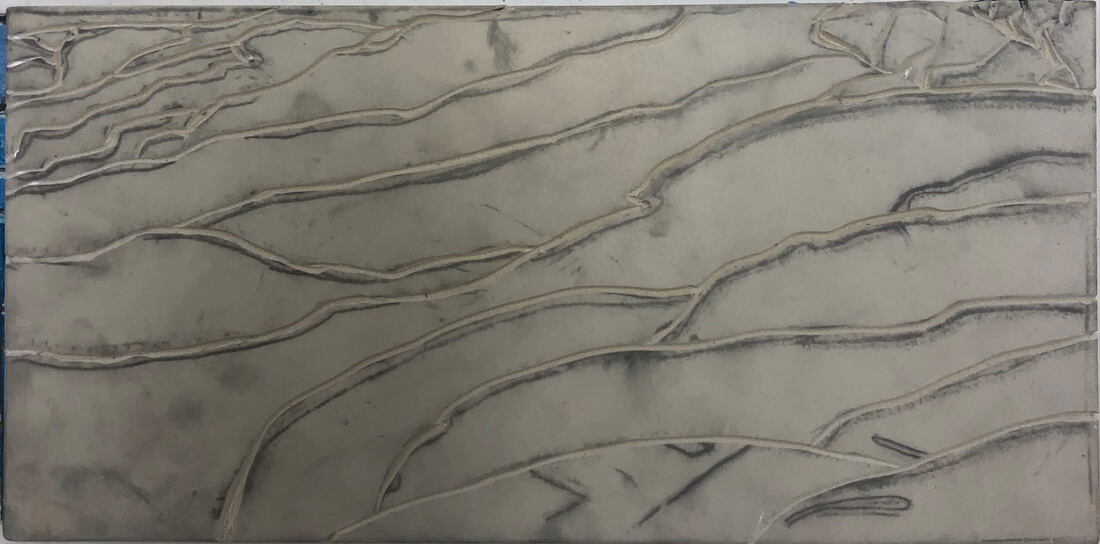
-registration and carving
I used thin, shallow strokes to create precise cuts. I used registration to correctly label my drawing to make is easier to identify.
-burnishing and ink coverage
I burnished the ink onto the paper to create solid layer of ink with less spots. I also used a lot of ink on the roller to get a lot of ink coverage.
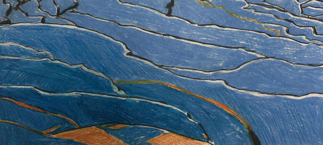
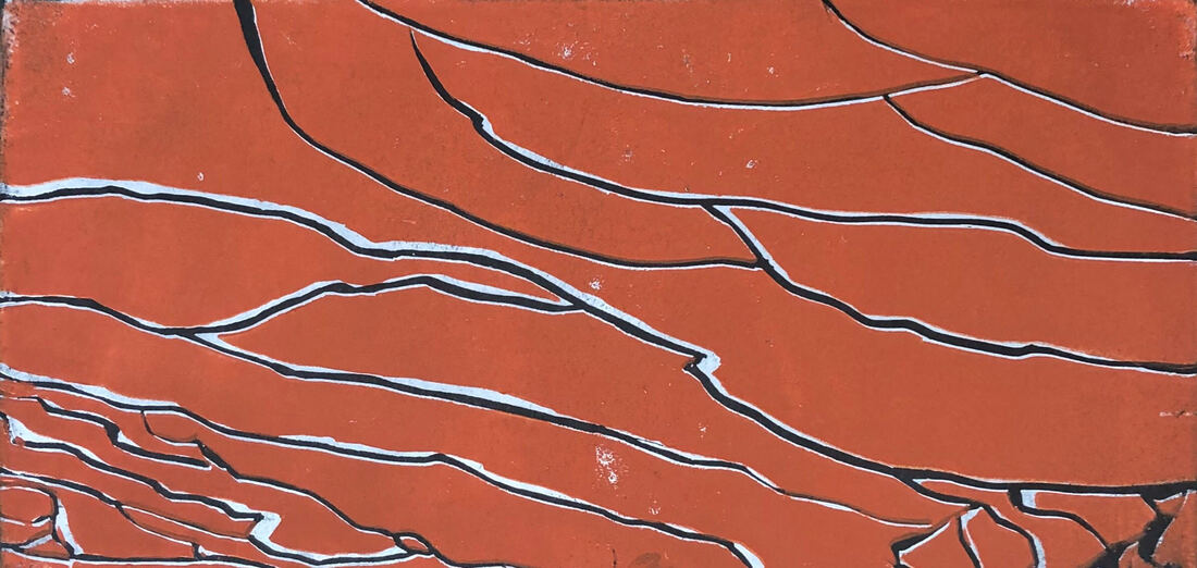
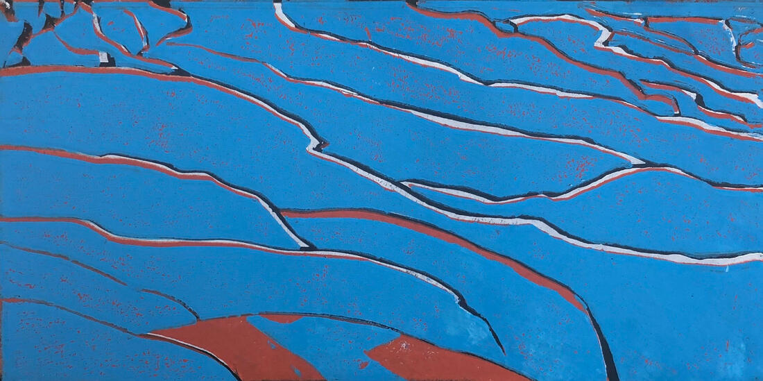
2. How did you use texture, color harmony and balance to define your choice of subject?
-texture
I used smooth texture to show the flat, reflective surface of the badab-e-surt. It has overlapping colors to show the layers of the plains.
-color harmony
I used complimentary colors to create contrast. The black and produce create clean, precise lines. The oranges and blues create interest.
--balance
The organic, unique lines produce asymmetrical balance which makes it look natural and adds interest.
3. If you could recreate your pieces what would you do differently to enhance your final outcome?
I would try to take more time to align the layers to make sure it lines up. I would also of used a texture to add more details.
-registration and carving
I used thin, shallow strokes to create precise cuts. I used registration to correctly label my drawing to make is easier to identify.
-burnishing and ink coverage
I burnished the ink onto the paper to create solid layer of ink with less spots. I also used a lot of ink on the roller to get a lot of ink coverage.
2. How did you use texture, color harmony and balance to define your choice of subject?
-texture
I used smooth texture to show the flat, reflective surface of the badab-e-surt. It has overlapping colors to show the layers of the plains.
-color harmony
I used complimentary colors to create contrast. The black and produce create clean, precise lines. The oranges and blues create interest.
--balance
The organic, unique lines produce asymmetrical balance which makes it look natural and adds interest.
3. If you could recreate your pieces what would you do differently to enhance your final outcome?
I would try to take more time to align the layers to make sure it lines up. I would also of used a texture to add more details.
painting and color wheel practice
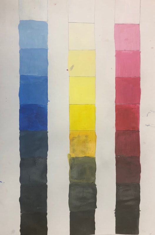
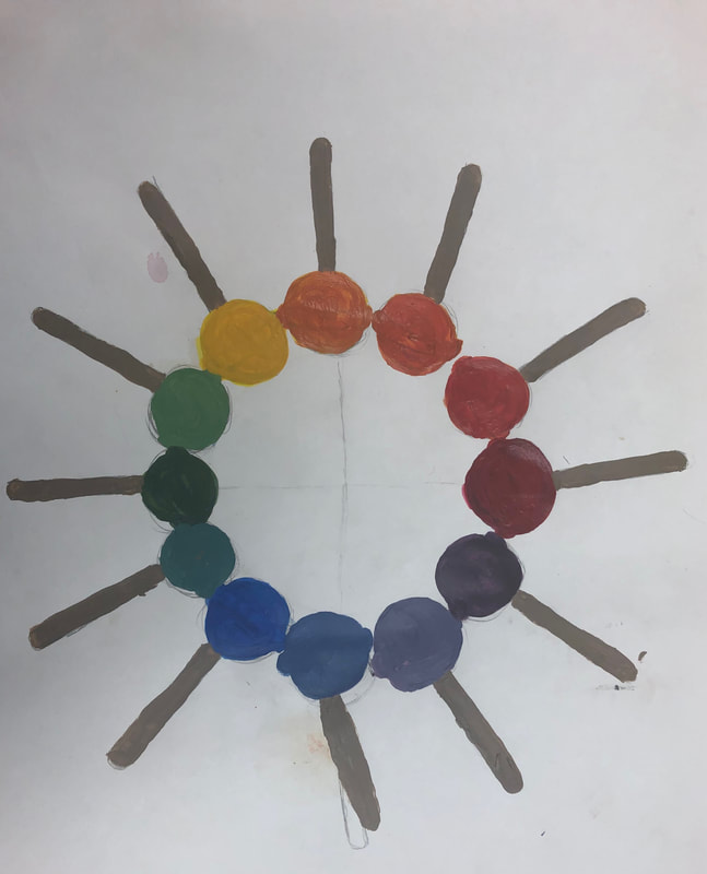
The first project was to have three columns one for each primary color. Then, we created tints and shades of those colors by adding white and black. The second project was to create a color wheel containing primary, secondary, tertiary colors. I chose to do a circle of lollipops; I wish I had taken more time to make straighter lines and make it more precise.
Clay Food Project: In Progress
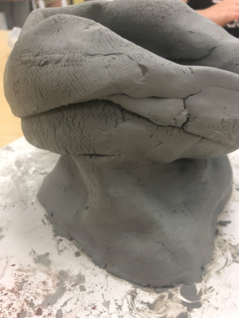
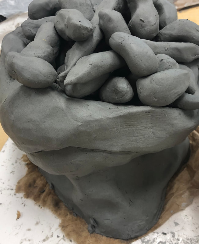
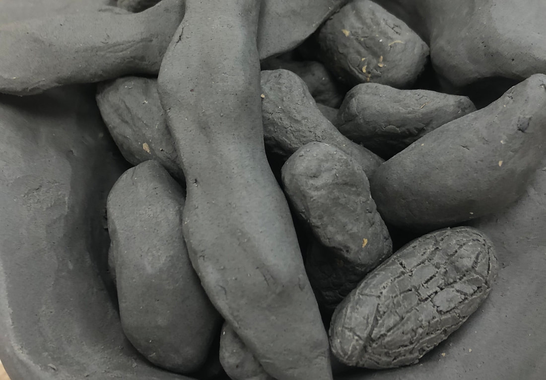
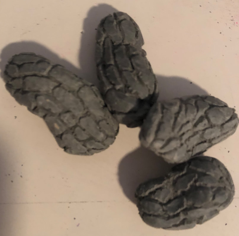
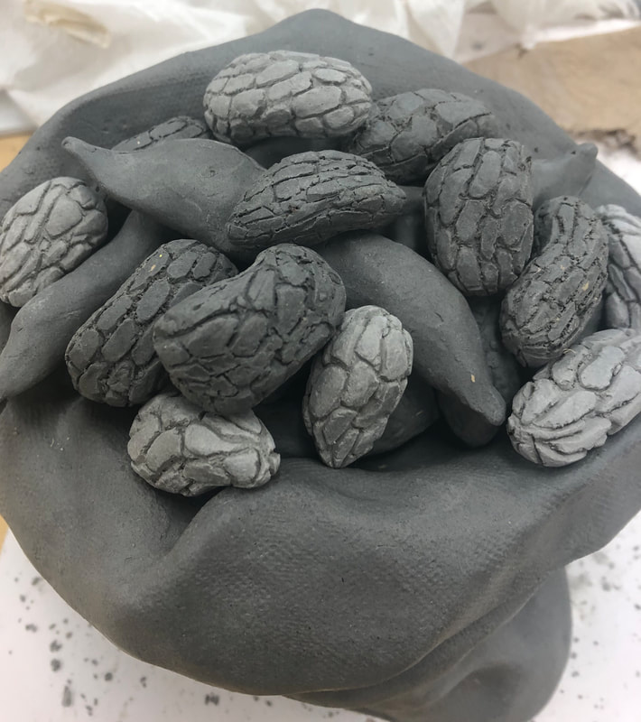
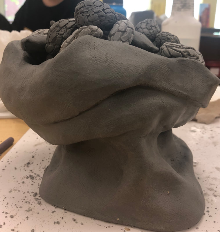
The project was to create a clay sculpture based off of food. I chose a burlap bag full of edamame and boiled peanuts. I rolled out slabs and squashed and molded the bag and then made individual clay pieces and carved out peanut textures.
